4 Zones of College Risk and Reward: Find Your Zone
A risk framework for evaluating college debt: Green Zone, Blue Zone, Yellow Zone, Red Zone. Which schools are worth the bet?


We've spent the last few articles showing you the traps of higher education.
The Parent PLUS shift, where families absorb debt that doesn't show up in the student loan numbers. The downside problem, where bottom-quartile earners face burdens that can consume their entire discretionary income. The schools where, no matter how you slice it, the debt math just doesn't work.
Today we're shifting to college risk and reward: where colleges go right, and how to think about both.
When we've shared our charts, people naturally gravitate to the areas where schools obviously look good. The green zones. The names in the bottom corner where debt is low and outcomes are solid. We're gonna do the same thing here today.
To do so, I'm going to introduce a risk framework built on the methodology I outlined last week. The goal is to give you a way to think about the reward alongside the risk.
In finance, there's something called the Sharpe ratio. In brief, it measures the return of an investment relative to the risk you took to get it.
If I told you "This investment returned 6%," that alone tells you nothing. You need to know if that return is commensurate with the risk. If I got you 6% by making extremely risky, highly leveraged bets that could cost you your home, you'd rightfully think I was crazy. And not very good at my job.
I think the same principle applies to school outcomes.
The question isn't just "What gives me the highest income?" It's "What gives me the best return consistent with the risk I'm capable of taking?"
"This school is the best" doesn't tell you much if it also means your parents are going to take out a crippling amount of debt to make it happen.
"This school has the best outcomes" is great. Until you need to take a break to work, pay the bills, and then you're still struggling to pay back the loans you took out to get that far.
One has to come with the other.
A framework to think about risk.
Let me explain how we're thinking about this.
We mentioned the Sharpe ratio earlier, but we're really gonna use the Sortino ratio for the grounding of this framework. The concept is the same: when you evaluate an investment, you don't just look at the return.
You look at the return relative to the risk you took to get it. That's what the Sharpe ratio does. It asks: how much return did I get per unit of volatility?
The difference is that the Sortino ratio only looks at downside risk.
When you're deciding where to go to school, you're not worried about what happens if things go better than expected. If you land a great job and make more money than the median graduate, you'll figure it out. The question that matters is: what happens if things don't go well? What's the downside? And can you survive it?
To capture this concept for higher education we're going to look at the 25th percentile (P25) and the 75th percentile (P75).
The 25th percentile is your downside case. If you line up all the graduates from a school by how much they earn ten years out, P25 is the person at the bottom quarter. Not the worst possible outcome, but a realistic "things didn't go as planned" scenario.
The 75th percentile is your upside case. Things went well. You're doing better than most of your peers.
The median, the 50th percentile, is fine for some purposes. But it hides the spread. Two schools can have the same median earnings and wildly different outcomes for students who end up in the bottom quarter.
What we're hoping to highlight is the spread between P25 and P75 outcomes at each school, and whether the debt load is manageable at both ends.
A school where P25 earners are doing fine and P75 earners are doing great? That's a school with a protected floor. You can take the bet knowing the downside is survivable.
A school where P75 earners are doing great but P25 earners are underwater? That's a different kind of bet. You're betting on yourself to beat the odds. Maybe that's the right call for you. But you need to know that's what you're signing up for.
Now let me show you what this looks like in the data.
Explore the interactive version →
Data: College Scorecard (2024 release), 10-year post-entry earnings. Analysis by College Azimuth.
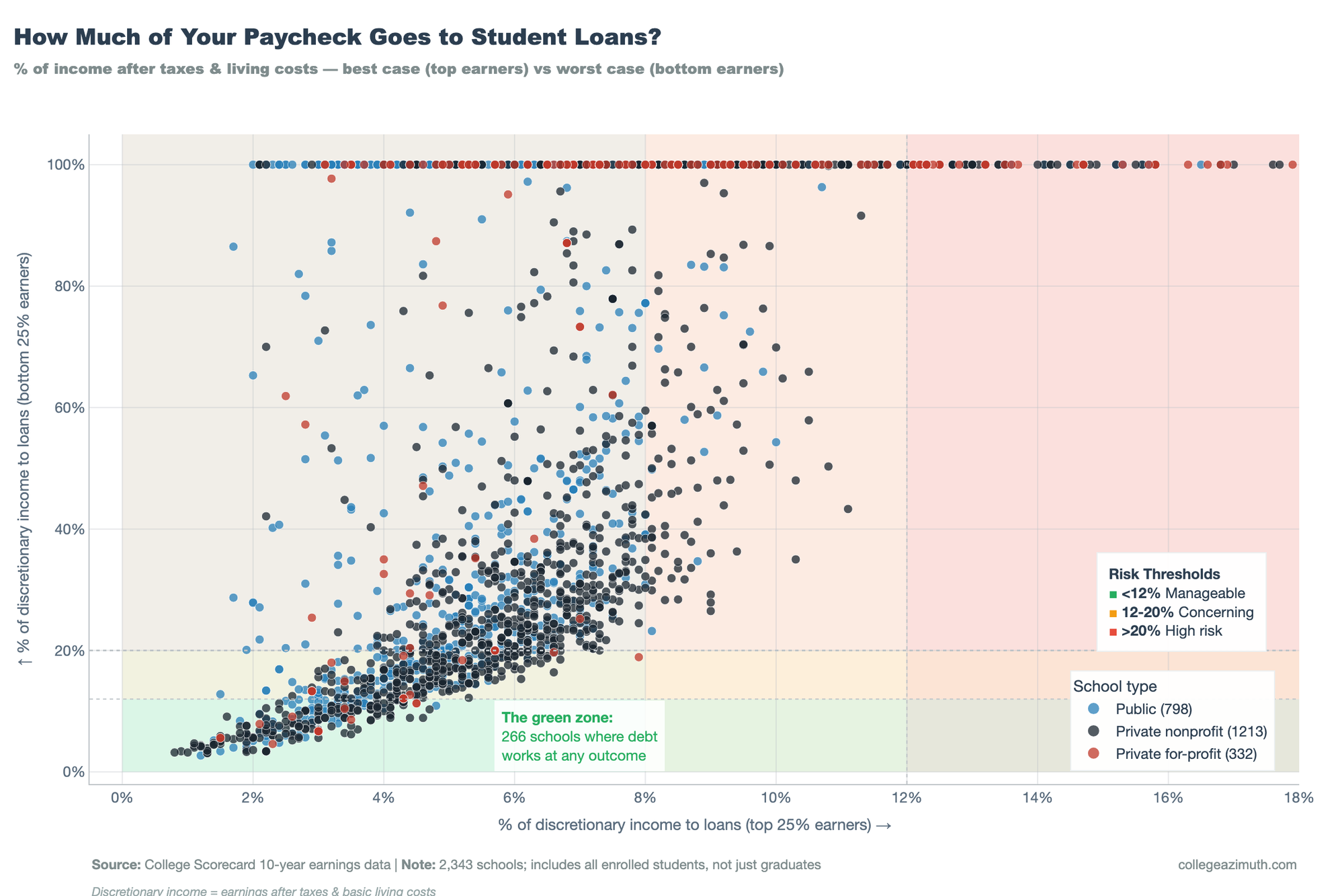
In this chart we calculated what the payment burden looks like at both the 25th and 75th percentile of earnings.
At the 25th percentile, if you're a bottom-quartile earner, 69% of schools put you in the high-risk zone. That's nearly 1,700 schools where the debt burden exceeds 20% of your discretionary income.
At the 75th percentile, if you're a top-quartile earner? Four schools. 0.3%.
That's a big spread, and moreso the risk return is asymmetrical. The downside is worse than the upside.
When you take on college debt, you're betting you'll land in the top half of earners from your school. If you do, the system works. If you don't, it breaks. There's not much middle ground.
This isn't inherently bad. Some bets are worth making. But you need to know you're making one.
The good news is this also tells us something useful: if you choose well, or if things go your way, the math works out for almost everyone. So the question becomes: what does "choosing well" actually look like? Which schools are safer bets than others? And how do you figure out where you fit?
So let's think about a framework that captures this.
Mapping the four quadrants of college risk
A quick note before we go further: the numbers I'm about to show you are based on student debt only. That's the debt the student takes on directly.
As we've discussed before, many families also take on Parent PLUS loans, which can be substantial, especially at private schools. We'll layer that in later. For now, I want to start with what students themselves are signing up for.
One more thing. We're using the median debt at each school. That's the middle of the distribution. I've been hammering the point that Median don't tell the full story, and that's true for this too but for now we'll keep this constant.
Based on this framework, we can sort schools into four categories. I think of them like investment profiles.
| Category | Definition | Schools | % | What It Means |
|---|---|---|---|---|
| Green Zone | P25 burden < 12% | 192 | 13% | Works even if things don't go your way |
| Blue Zone | P25 burden 12-20%, P75 < 12% | 524 | 35% | Depends on your situation |
| Yellow Zone | P25 burden ≥ 20%, P75 < 8% | 713 | 48% | Only works if you outperform |
| Red Zone | P75 burden ≥ 12% | 52 | 4% | Doesn't work even at the top |
The Green Zone: High Return, Low Variance.
These are schools where the math works even if things don't go your way. The 25th percentile burden is below 12%. You're not betting on being exceptional. You're buying broad market exposure with a protected floor.
192 schools fall into this category. That's 13% of four-year institutions.
Blue Zone: Decent Returns, Decent Variance. Your experiences may Vary
These schools are in the middle. The 25th percentile burden is between 12% and 20%, concerning but not catastrophic. The 75th percentile is still under 12%. Whether this works for you depends on your situation, your backup plan, your tolerance for financial stress.
524 schools. 35% of the total.
Yellow Zone: High Returns, High Variance
These are high-variance bets. The 25th percentile burden is above 20%, often way above. But the 75th percentile is under 8%. If you land in the top quarter, you're golden. If you don't, you're underwater.
This is where most schools live. 713 of them. 48%.
Nearly half of all four-year schools are growth stocks. The median school in America isn't low-risk. It's a bet on yourself to outperform.
Red Zone: Be Careful
These are schools where even the upside doesn't work. The 75th percentile burden is above 12%. Even if you're in the top quarter of earners, you're still stretched.
52 schools. 4%.
When the top quarter of graduates can't comfortably manage the debt, that's not a risk tolerance question. That's a structural problem.
The takeaway here isn't that the schools in the Red Zone are bad, per se. Some people should take that bet. The takeaway is that you need to know which kind of school you're looking at before you sign.
Most people assume the school they're considering is an index fund. The data says otherwise.
And remember: this is just student debt. When we add Parent PLUS loans into the picture, the numbers shift. Some schools that look like index funds on student debt alone start looking a lot riskier when you see what parents are borrowing.
We'll talk more about that tomorrow.
Adapting this to your situation.
You're probably not gonna borrow the median amount. You're gonna borrow whatever your financial aid package leaves you with. Same school, wildly different debt loads depending on your family's situation.
So how do you use this for yourself?
This is where we start to think about risk profile. There are two parts of this:
Mindset is how much uncertainty you can handle emotionally.
Some people are fine with volatility. They can take a swing, miss, and figure it out. Others need stability. The stress of not knowing whether the bet will pay off isn't worth it, even if the expected value is positive.
Neither is wrong. Know which one you are.
In my case I was willing to take risks for myself (join the Army), but I wasn't willing to take risks for my family (ask them to pay an amount they couldn't afford).
Capacity is how much you can actually afford to borrow, and how much cushion you have if things go sideways.
Before you start comparing schools, figure this out. Not what a school says you can borrow. Not what the financial aid office suggests. What you can pay back without it wrecking your life.
So how do you think about your capacity?
The basic idea: take your family income, subtract what it costs to live (housing, food, healthcare, transportation), and what's left is your discretionary income. Our calculations assume a base modifier consistent with federal student loan guidelines. That's what you can actually allocate to debt payments. Work backward from there to a total debt number.[^1]
This is not going to be the case for your family.
The Financial GPS can help you run these numbers. Plug in your family's income, the school, the major, and the debt you're actually looking at. It'll show you where you land.
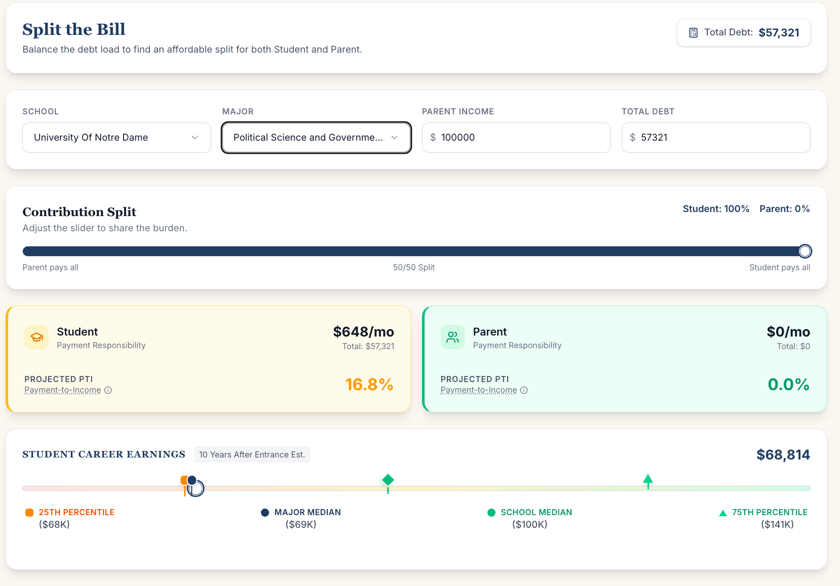
The Financial GPS shows how different majors and debt splits affect your payment burden. Same school, same debt—but Political Science at P25 means 16.8% of your income to loans.
Capacity also includes your safety net. If your family can cover rent for six months while you job search, you have more capacity than someone who's on their own the day after graduation. If your parents can help with payments during a rough patch, that's capacity. If they're stretched themselves, it isn't.
Here's how these map to the quadrants:
- High capacity + high tolerance: Yellow Zone might make sense. You can afford the downside and handle the stress.
- High capacity + low tolerance: You could technically afford a school in the yellow zone, but the uncertainty isn't worth it.
- Low capacity + high tolerance: Be careful. You might want to take the swing, but you can't afford to miss.
- Low capacity + low tolerance: Green zone is where you want to be. The math has to work even if everything else doesn't.
Most people overestimate their capacity. They assume things will work out because they usually do. But "usually" isn't "always," and loan servicers don't care about your optimism.
The point isn't to reduce your college decision to a debt calculation. College isn't just about money. The relationships you build, the things you discover about yourself, studying something you love even if it doesn't pay (check our rankings to explore). That's real.
But signing loans is a decision you can't walk back. The goal is to know what you're signing before you sign it.
[^1]: This is educational information, not financial advice. Your actual capacity depends on your complete financial picture: existing debt, credit cards, medical expenses, other obligations. Talk to a financial advisor or counselor who can look at your specific situation before making borrowing decisions.
A quick caveat: This framework uses median debt and student loans only. It doesn't include Parent PLUS (we'll cover that tomorrow), and your family's actual debt may look different. We're not saying Red Zone schools are "bad"—only that you should know what kind of bet you're making.
Tell me what you think
This is a nascent attempt to build a framework around how to think about college risk and reward. I don't have a monopoly on it. If you have thoughts, questions, or think I got something wrong, I want to hear it. Drop a comment or reach out directly.
If you want to catch up on the series: - The methodology behind payment burden - The Parent PLUS shift - The downside problem