Is College Worth It? The Net Price Problem No One Talks About
The median college grad breaks even by 27. But at the same school, net price can vary by $50K+ based on income. Here's what the affordability debates miss.

I wanted to explore the topic of "Is College Worth It?" and I'm going to do it over a few days, because I think this is a big topic and worth really thinking through.
Recently, a Brookings economist published a piece arguing that college affordability debates "get wrong" the returns to college. His math is directionally correct, and the conclusions he draws make some sense.
However, in reality people don't live exclusively on the median line. And they can't always live up to the basic assumptions we make for the sake of argument.
So over the next few pieces, I want to unpack some of the reasons why "college might not be worth it" — not to argue against higher education, but so we can discuss earnestly the ways in which it is.
As always, I like to start with a story.
The Reality behind the numbers
I went through Chicago Public Schools when the graduation rates were dismal. Something like 1% for an African American male to come out of CPS and graduate from college.
I also had a lot going on at home, so I didn't really apply myself (to put it mildly). I used to work at the UPS factory in the Chicago suburbs, so after school every day I'd hop on the 6 bus to 79th Street, take the 79th Street bus to the end of the line, and then take another suburban bus to the UPS warehouse to load trucks up for several hours. Needless to say, I didn't do much homework.
Anyway, one day the college counselor pulled me out of class to give me something of a talking to. Apparently, she had seen my test scores (which were good), and my grades (which... lol... were not). It was at the point where she was trying to convince me I could end up at the University of Chicago one day that I had to stop her.
"Look. I'd love for that to happen, but I'm obviously not on the scholarship track. How much is it over there — thirty thousand dollars a year? Here's my situation. My mom is working herself to death for thirty-five thousand a year. I pull in another fifteen or so working second shift at the warehouse. My dad is an alcoholic, which probably costs us another ten grand a year all in. So you expect me to quit my job, focus on school, so maybe one day in the future I can end up at a 'good school' to spend more money than my family has ever seen in a year? How exactly am I supposed to do that?"
She of course wasn't necessarily wrong. She just didn't know how to be right for someone like me.
I tell you this story to make the following point: we often talk about the pursuit of higher education in ways that might be right "in general" but are often wrong in practice — and it's important to understand how that can happen.
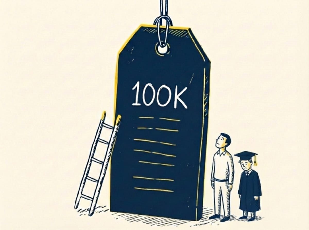
Let's start with the most basic question: How much does college actually cost?
The answer is more complicated than it looks.
What Net Price Actually Means
When people talk about college affordability, they often cite "net price" — the actual cost after grants and scholarships. And they're right that net prices have been relatively flat in recent years.
Net price is a real number. It's calculated. It's published. You can look it up on College Scorecard — or use our Financial GPS tool to see what you'd actually pay.
But here's what that number obscures: at the same school, net price can vary by $50,000 or more depending on your family's income.
At University of Pennsylvania:
| Family Income | Net Price at UPenn |
|---|---|
| Under $30K | ~$1,000 |
| $48K-$75K | ~$18,000 |
| Over $110K | ~$57,000 |
Same school. Same degree. Wildly different prices.
Here's what this means in practice: as your income goes up, so does your expected contribution — almost dollar for dollar. The financial aid formula essentially assumes that every additional dollar you earn above a certain threshold should go toward your child's education.
A family making $100K might look "comfortable" on paper. But after taxes, housing, healthcare, maybe a car payment — they don't have $50K sitting around any more than a family making $40K has $15K sitting around. The increase in income is completely subsumed by the increase in net price.
And it's about to get worse.
The Sibling Penalty (2024-25 FAFSA Changes)
Until recently, the federal financial aid formula gave families credit for having multiple kids in college at the same time. If your Expected Family Contribution was $30K with one kid, it would split to $15K per kid if two were enrolled simultaneously.
Starting with the 2024-25 school year, that's gone. The new formula — called the Student Aid Index — no longer divides by the number of children in college. If the formula says you can pay $30K, you're expected to pay $30K per kid. Two kids in college? $60K expected. Three? $90K.
The federal government now assumes you can pay full price for every child simultaneously.
Some schools — like MIT and Duke — say they'll still consider siblings in their institutional aid. But that's school-by-school, not guaranteed, and most families won't know until they see the award letter.
The question isn't what the "average" net price is. It's whether the price you're being quoted is actually payable from what your family has — or whether it's going to require debt, sacrifice, or some combination of both.
What "Affordable" Actually Looks Like
So let's look at the data. What does net price actually represent as a share of family income?
We pulled data on over 2,300 colleges and calculated burden — net price as a percentage of family income at each income level. Here's what the average looks like:
| Family Income | Average Net Price | Burden (% of Income) |
|---|---|---|
| Under $30K | ~$12,700 | 85% |
| $30-48K | ~$13,300 | 34% |
| $48-75K | ~$15,900 | 26% |
| $75-110K | ~$19,300 | 21% |
| $110K+ | ~$22,500 | 15% |
Institutions often describe their financial aid as "progressive" — and in raw dollar terms, they're right. A family earning $30K pays less than a family earning $110K.
But look at the burden column.
The poorest families are asked to pay 85% of their income. The wealthiest pay 15%. That's not progressive. That's regressive. The less you have, the larger the share you're expected to sacrifice.
This is what "income-adjusted pricing" actually looks like in practice. Yes, lower-income families pay fewer dollars. But those dollars represent a vastly larger share of everything they have. The system is designed around dollar amounts, not around what families can actually afford.
At first glance, you might think: "Well, the $100K family is paying 15% — that's manageable."
But let's do the actual math.
A family earning $100K — let's say that's gross household income — probably takes home around $75K after taxes. Now subtract: - Housing (mortgage/rent, property taxes, insurance): ~$24K - Healthcare (premiums, out-of-pocket): ~$8K - Transportation (car payments, insurance, gas): ~$8K - Food: ~$10K - Utilities, phone, internet: ~$5K
That's $55K in baseline expenses. Which leaves about $20K for everything else — retirement savings, emergency fund, the kids' activities, life.
Now you're telling them to pay $22,500 for college?
That's more than their entire discretionary budget. And that's assuming ONE kid in college.
The family making $50K? After taxes and the same baseline expenses (scaled down), they might have $5-10K of discretionary income. They're being asked to pay $16K.
Both families are being asked to pay more than they have.
The difference between "poor" and "middle class" in this system isn't that one can afford college and the other can't. It's that one is obviously underwater and the other is quietly drowning.
The System-Wide Picture
But averages can be misleading. Let's break this down by institution type.
| Sector | <$30K | $30-48K | $48-75K | $75-110K | $110K+ |
|---|---|---|---|---|---|
| Private nonprofit | 124.5% | 47.2% | 32.8% | 25.6% | 20.5% |
| Public | 53.7% | 24.1% | 19.8% | 15.9% | 10.8% |
Private nonprofits are brutal across the board — but notice how the $30-48K band (families earning ~$40K) faces a 47% burden. That's families making just above the poverty line being asked to pay nearly half their income.
And how many schools have burden levels above what we'd consider dangerous?
| Burden Threshold | Schools (of ~3,100) | Percentage |
|---|---|---|
| > 30% of income (needs loans) | 2,656 | 85% |
| > 50% of income (severe) | 2,119 | 68% |
| > 100% of income (more than they earn) | 991 | 32% |
At nearly 1,000 schools, the net price for families earning under $30K exceeds their entire annual income.
The Full Picture by School
Here's what burden looks like across the entire income spectrum at well-known institutions — with sample sizes so you can see who's actually represented:
| School | <$30K | $30-48K | $48-75K | $75-110K | $110K+ |
|---|---|---|---|---|---|
| MIT | -27.5% (n=28) | -5.6% (n=60) | 8.4% (n=75) | 14.9% (n=29) | 31.1% (n=124) |
| Brown | -14.4% (n=44) | 5.5% (n=47) | 13.2% (n=92) | 21.0% (n=74) | 30.5% (n=242) |
| Stanford | -0.5% (n=82) | -1.3% (n=125) | 2.4% (n=96) | 10.2% (n=35) | 33.6% (n=97) |
| CUNY Hunter | 1.7% (n=999) | 5.6% (n=620) | 9.9% (n=381) | 8.8% (n=70) | 8.1% (n=35) |
| UPenn | 6.6% (n=145) | 11.9% (n=144) | 29.3% (n=141) | 32.1% (n=130) | 38.0% (n=393) |
| Michigan | 32.8% (n=294) | 14.1% (n=203) | 13.6% (n=248) | 17.0% (n=207) | 17.9% (n=509) |
| UC Berkeley | 39.3% (n=696) | 19.7% (n=450) | 19.4% (n=413) | 20.0% (n=267) | 23.4% (n=498) |
| Georgia Tech | 49.9% (n=134) | 23.4% (n=103) | 22.0% (n=123) | 18.3% (n=87) | 11.5% (n=231) |
Note: Sample sizes reflect Title IV aid recipients in each income band. $110K+ burden calculated assuming $150K midpoint.
The sample sizes tell a story of their own.
MIT's impressive -27.5% burden for families under $30K? That's based on 28 students. Meanwhile, CUNY Hunter's 1.7% burden at the same income level represents 999 students — a far more statistically meaningful figure.
Look at who's actually enrolled at these schools. At Brown, 242 of 499 students in this data (49%) come from families earning $110K+. At CUNY Hunter, it's 35 of 2,105 (1.7%). Elite private schools can tout generous aid for low-income students precisely because they enroll so few of them.
Now look at the middle columns.
UPenn's <$30K band looks relatively generous at 6.6%. But the $48-75K family? They're paying 29% of their income. The $75-110K family? 32%.
This is where the squeeze happens. Elite schools can point to their low-income generosity while the middle class — families making $60K, $80K, $100K — get crushed.
It's not that the <$30K data is wrong. It's that it tells a selective story. The families most likely to be caught off-guard are the ones who think they're "too wealthy for aid" but not wealthy enough to actually pay.
What This Means For You
Here's the question that actually matters: At what point does net price become debt?
The burden numbers we've shown — 85% of income, 124% of income — make it obvious that most families can't pay from earnings alone. When net price exceeds what you can pay, the gap becomes debt. And that's where the data gets specific.
We analyzed repayment outcomes for over 1,400 schools — five years of data on who paid off their loans, who defaulted, and who ended up stuck in forbearance. What predicts whether graduates struggle isn't how much they borrowed in absolute terms. It's how much they borrowed relative to what they earn.
| Debt-to-Earnings Ratio | Default Rate |
|---|---|
| Under 25% | 3.6% |
| 25-50% | 6.4% |
| 50-75% | 12.3% |
| Over 75% | 24%+ |
The pattern is almost perfectly linear — every step up in debt-to-earnings corresponds to worse outcomes. But there's a cliff: once debt exceeds about 75% of first-year earnings, default rates triple. One in four borrowers ends up in default.
What does this mean in practice?
If you're looking at a school where the net price you can't cover from income will require $40,000 in loans, and the typical graduate earns $50,000 — that's a debt-to-earnings ratio of 0.80. You're in the danger zone. If that same school produces graduates earning $80,000, the ratio drops to 0.50, and your odds improve dramatically.
This is why we built our Financial GPS tool. It doesn't just show you the net price — it shows you what that price means given your likely earnings, what the monthly payments would be, and whether those payments are manageable relative to what you'd have left after necessities. We flag programs where the debt burden would exceed 10% of your discretionary income — the threshold where graduates start to struggle.
The burden tables above tell you whether a school is asking for more than you have. The debt-to-earnings data tells you what happens if you borrow the difference. Both matter. But only one has predictive power — and it's not the sticker price.
The Counselor's Dilemma
Back to that counselor who pulled me out of class.
She wasn't wrong that college could change my life. She wasn't wrong that my test scores suggested I could succeed academically. She wasn't even wrong that schools like the University of Chicago offered significant financial aid.
What she didn't have was a framework for understanding what "affordable" actually meant for a family like mine. She had averages. She had statistics. She had good intentions.
What she didn't have was the way for me to think about how I could navigate the very real burden that higher education represented for me and my family.
This is Part 1 of a six-part series examining why "college is worth it" claims break down in practice.
Next: What happens when families can't cover the gap from income? We'll look at who else ends up on the hook — and how family debt changes the entire ROI calculation.